 17, November 2023
Understanding Color Correction vs. Color Grading and Avoiding Common Pitfalls
Unveiling the Art of Cinematic Color: Understanding Color Correction vs. Color Grading and Avoiding Common Pitfalls
Introduction:
In the realm of filmmaking and video production, the mastery of color plays a pivotal role in shaping the visual narrative. Two terms are frequently thrown around in this context are "color correction" and "color grading." While they sound similar, they serve distinct purposes in the post-production process. This blog post aims to demystify the differences between color correction and color grading, shedding light on their unique roles. Additionally, we'll explore common color grading mistakes and how to sidestep them to achieve a polished and visually compelling result.
Understanding Color Correction:
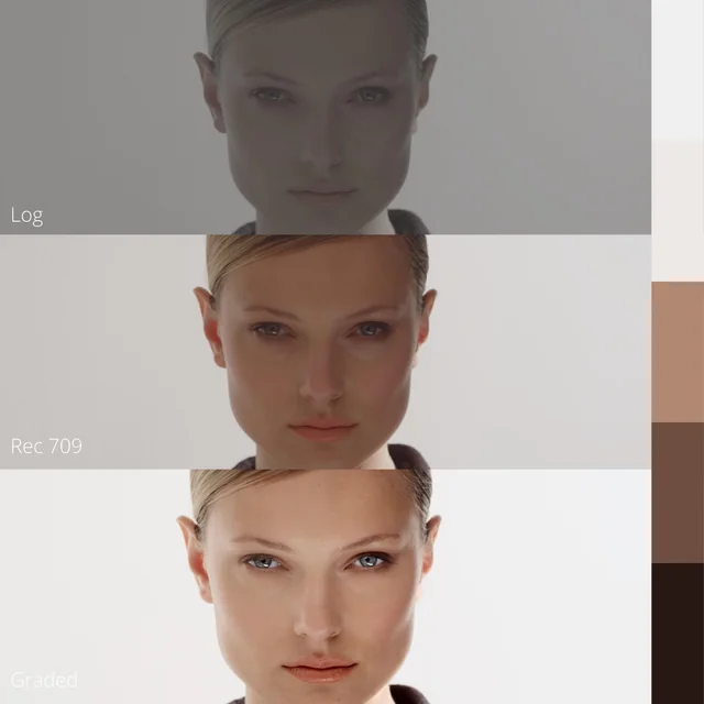
Color correction is the initial step in the post-production process, focusing on rectifying any irregularities in the footage. Its primary goals are to establish a neutral and balanced look, correcting exposure, white balance, and contrast issues. Color correction ensures that the colors in the footage are accurate and true to life, laying the foundation for subsequent creative enhancements during color grading.
Defining Color Grading:

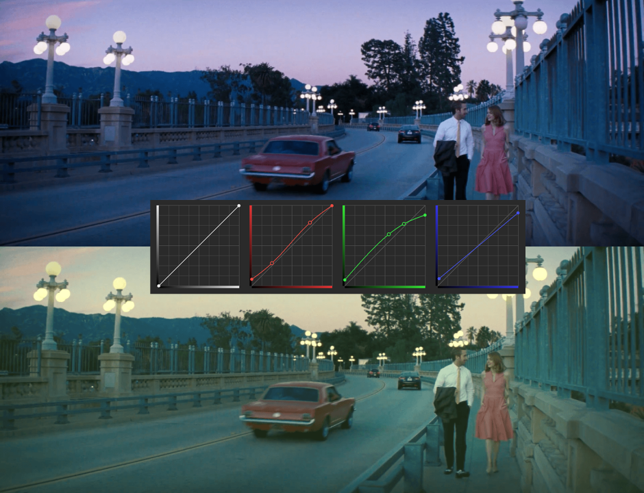
Color grading, on the other hand, is a more artistic and subjective process that follows color correction. It involves manipulating the colors to evoke specific emotions, enhance storytelling, and establish a distinctive visual style. Color grading allows filmmakers to create a unique atmosphere, emphasize themes, or transport viewers to a different time or place. It involves adjustments to saturation, hue, and luminance, among other factors, to achieve the desired look and feel.
Common Color Grading Mistakes and How to Avoid Them:
1. Overuse of Filters:
- Mistake: Applying filters excessively can result in an unnatural and over-stylized appearance. - Solution: Exercise restraint and use filters judiciously, ensuring they contribute to the narrative rather than overpowering it.

2. Inconsistent Color Palette:
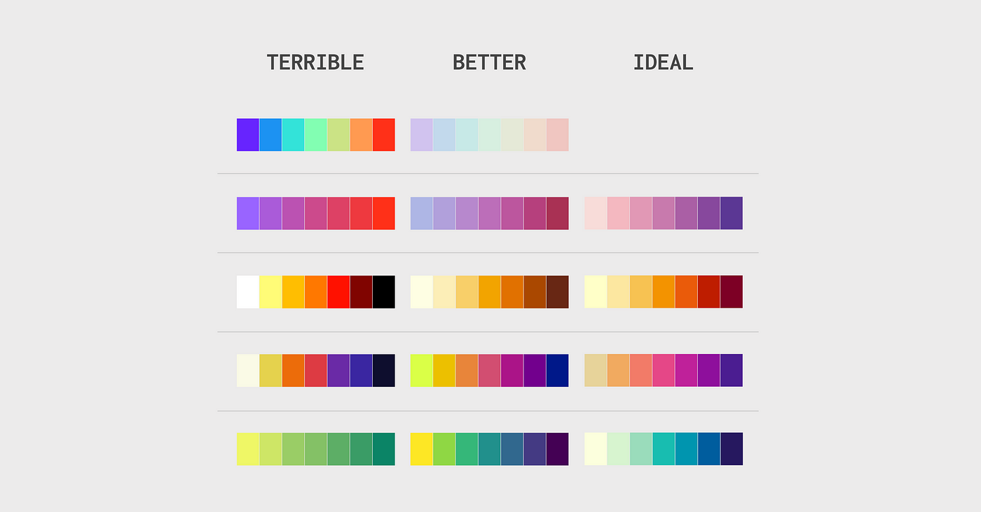
- Mistake: Inconsistency in color grading across scenes can disrupt the visual flow and narrative coherence. - Solution: Establish a cohesive color palette that aligns with the mood and themes of the project, maintaining consistency throughout.

3. Ignoring Skin Tones:
- Mistake: Neglecting proper treatment of skin tones can lead to unnatural and jarring visuals. - Solution: Pay meticulous attention to skin tones, ensuring they remain realistic and natural throughout the color grading process.

4. Overlooking Color Contrast:
- Mistake: Poorly managed color contrast can diminish visual impact and make the image appear flat. - Solution: Experiment with color contrast to highlight key elements in the frame, adding depth and visual interest.

5. Neglecting Story Context:
- Mistake: Applying color grading without considering the story's context and emotional beats can misalign visuals with narrative intent. - Solution: Understand the story's emotional arc and adjust color grading to complement and enhance these narrative elements
6. Ignoring Technical Details:
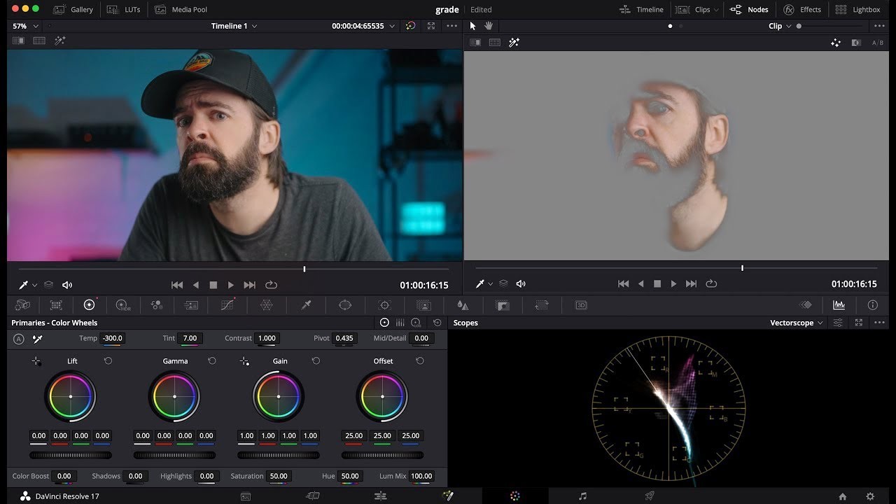
- Mistake: Neglecting technical aspects such as black levels, highlights, and color balance can result in an unprofessional and inconsistent look. - Solution: Attend to technical details during both color correction and grading, ensuring a polished and professional final product.
Conclusion:
Mastering the nuances of color correction and color grading is essential in the intricate tapestry of visual storytelling. By understanding the distinctions between these processes and being mindful of common pitfalls, filmmakers can elevate their projects, delivering visually stunning and emotionally resonant content that captivates audiences. The art of color correction and color grading is not only technical but also deeply creative, offering filmmakers a powerful means of expression in the visual language of cinema.

